

eCommerce Home Page Layout Guideline
- Oct 16, 2025
- 10 min read
Updated: Dec 21, 2025
Make Your First Page Your Strongest Sales Tool

Your eCommerce homepage is often the first page potential customers land on. It needs to quickly communicate what you sell, who it’s for, and why they should trust you, with a clear path to purchase.
Let’s walk through the basic building blocks of a successful homepage. Feel free to use this as a starting point for your own eCommerce site. The beauty of any website is it’s built in sections, so it is easy to reorder, add or delete content to suit your own online store needs.

The Building Blocks
I love building websites. To me it is more than just information on a digital page. Your website gives you the opportunity to not only present your brand or product to audiences, it allows for you to build a journey that connects and solves problems for your online marketplace.
They are just moveable blocks
That's all a website home page or landing page really is. Content blocks that you create to foster a connection with your audience. You can stack them in different ways in order to guide your website visitors through a customized user experience. The beauty of it all is you can change and reorder them in order to introduce new products, optimize your site for more sales, or highlight a seasonal promotion you have going on.
Let's start building.

Recommended Content Block Layout
There are so many ways to stack them on your page. What I have outlined below is more of a classic layout. If you are newer to the world of building websites, or just want a website layout that works, I highly recommend starting here. Build it and then change it however you like. Consider this guideline as your ecommerce home page cheatsheet.
For the example on this page I created the company things. This is to give you ideas on how each content block and section can look and feel.
1. Header (Sticky Navigation)

Your ecommerce website design starts with the header at the top of the page. This will not only show up on your homepage design, but across your entire site. Your header should provide easy navigation for the best customer experience.
What to Include:
Logo (linked to home)
Navigation Menu (limit to 4–6 top-level links)
Cart Icon (with item count)
Search bar (especially if you have lots of products)
Optional: Sign in/My Account link
Optional: Buy Now Button/Shop Now Button
Pro Tips:
Use a sticky nav bar that follows users as they scroll.
Include a CTA (e.g. “Shop Now”) in the top right.
Logo
Your website’s navigation header plays a big role in determining how your logo appears across your site. Best practice is to place your logo in either the upper left corner or centered within the header, both are widely accepted and come down to design preference. Just make sure it aligns with your overall aesthetic and doesn’t compete with key navigation elements.
Navigation Menu
Think of your Navigation Menu like a store directory, it should help visitors find what they need without overwhelming them. If your menu looks crowded or you see a “More” option appear automatically, that’s a sign to simplify. Focus on the most important pages that help people take the next step, like shopping your products or learning what you’re all about. A clear, easy-to-follow menu makes your website feel more welcoming and easier to use.
Typical Navigation Menu Links: Home, Products (or Services), About, Contact
If you have a lot of product or services categories, then you can consider adding a drop down menu for this particular link.
Icons
Cart Icons, search bar and sign in links are typically found on the upper right hand side of your website header.
Buy Now or Shop Now Button
Make the most of your top-right corner, it’s prime real estate. The best eCommerce websites use this space for a “Shop Now” button because it’s one of the first places visitors look. Turn it into a clickable button to grab attention and lead customers directly to your main product page. If you sell just one item, you can use “Buy Now” instead. Other options like “Buy Tickets,” “Join Us,” or “Book Now” can be used depending on your specific products or services, just make sure it clearly supports your main goal: making a sale.
Navigation Scrolling Options
You have options when it comes to how your navigation menu behaves when someone is scrolling through your site. Here are the most common settings:
Static: The menu disappears as users scroll.
Sticky: The menu stays locked at the top of the screen.
Hide on Scroll Down, Show on Scroll Up: The menu disappears while scrolling down but reappears when scrolling back up.
I recommend going with either the sticky or reappearing option. This keeps your “Shop Now” button, product links, and cart icon visible so they’re always there when a customer is ready to buy.
Pro Tip: Don’t forget about your mobile navigation! Mobile menus behave differently than desktop, so double-check that they’re just as clean, functional, and user-friendly on smaller screens.
Find more great navigation tips in the Website Content Organization Guideline.
2. Hero Section

What to Include:
High-quality lifestyle or product image
1-line headline that speaks to your value prop
Subheadline that supports your main point
Primary CTA (e.g. “Shop Bestsellers” or “Start Your Free Trial”)
Action Step:
Write your homepage headline and subheadline.
Choose a CTA based on your primary goal.
Your hero section is your first impression and it counts. It’s your brand’s introduction and should include a clear, compelling primary call to action. Most visitors decide within just 6 seconds whether to stay or leave, so use this space to quickly grab their attention, communicate what you offer, and invite them to explore more of your site.
Video option: Sometimes a video hero is a great way to set the mood, tone and build excitement for your brand. If you choose this option then this has to be a very impactful and high-quality video. Remember - you will need to still have an image chosen for mobile devices.
Pro tip: Make it skimmable. Most people do not read (until they are truly invested) - they skim. Short and impactful headline and subheadlines are key with a very good quality and relatable image.
3. Trust Section (Mini About / Social Proof)

Options to Include:
Short line about your brand or unique mission
Logos of press mentions or awards with links
Star ratings or testimonials (more about this later)
Pro Tip:
Keep it skimmable, trust is built in seconds.
Trust is one of the biggest deciding factors when it comes to whether potential customers choose to make a purchase.
When someone is newly introduced to your product or service, you need to establish credibility, and fast. There are several key ways to build trust on your eCommerce store: use high-quality images, write clear and professional copy, display recognizable trust badges (like secure payment icons or verified checkout seals), and showcase real customer testimonials.
Recommended Layout: One of the most effective placements for trust-building is a horizontal bar just below your hero section featuring brand alignment: logos of well-known companies, media outlets, or retailers that have reviewed, featured, or partnered with your ecommerce business. These instantly boost your credibility by helping customers associate your brand identity with trusted names.
Don’t have this kind of brand recognition yet? No problem. Move your testimonials or customer review section up to this spot instead, social proof is just as powerful. (See testimonial or reviews section below)
Want more ways to build trust with your audience? Check out our full guide: How to Build Trust Sections on Your Website.
4. Featured Product or Collection Blocks

What to Include:
1–3 product collections (e.g. New Arrivals, Bestsellers, or Top Categories)
Product cards with product images, name, and price
CTA (e.g. “View All”)
Action Step:
Choose the top 3 collections or product categories pages you want to highlight.
Your best products or services are the star of the show, make sure they shine.
As an online store, you want your offerings to be front and center, easy to find, and visually appealing to prospective customers. Your homepage should speak to everyone: first-time visitors just discovering your brand, as well as loyal customers ready to make another purchase.
A great way to guide your audience is through curated product collections. Start with a Featured or Best Sellers section near the top of your homepage. Then add other blocks based on the kind of products, new arrivals, or categories that fit your business model.
Try it out: Don’t be afraid to test different featured products or the order in which collections appear. Run a few A/B tests, track performance in your analytics, and take note of which layouts or product highlights drive the most sales. Smart testing is one of the best ways to increase conversion rates over time.
5. Benefit or Value Prop Section

What to Include:
Engaging Headline
Relatable Subheadline
3–4 bullet points or a short blurb explaining why your products are different and how it solves your audience’s problems.
Optional: Image that complements copy
Pro Tip:
Make each benefit about the customer not just the product.
You’ve captured their attention, now it’s time to connect the dots. Your audience has browsed your products, they’re interested. Now, help them see how your product fits their life. This is your chance to make it personal and push them toward that final decision.
At this stage of the funnel, your potential customer is already considering a purchase. Use this moment to clearly show how your product solves a specific problem or adds value.
What to avoid: Don’t overwhelm them with lengthy descriptions or too many selling points. Keep it clear, concise, and benefit-focused. Stick to no more than 3–4 key points or bullets. Too much information here can actually create doubt and distract from the conversion.
6. Testimonials or Reviews

What to Include:
Quote-style testimonials
Product reviews with star ratings
Photos if available
Optional Add-on:
Add a “Before & After” or use case scenario block.
Testimonials and reviews are powerful forms of social proof that build immediate trust with potential customers. People trust what other people say, it’s that simple. You can use tools that pull in real-time reviews from third-party platforms, or hand-pick your strongest testimonials to create a curated section on your site.
Pro tip: Incorporate testimonials into callouts to reinforce specific benefits and make a deeper connection. Strategically placing quotes throughout your site is a great way to support key points, build credibility, and create bite-sized stories that resonate with your target audience.
7. Email Sign-Up (Lead Capture)
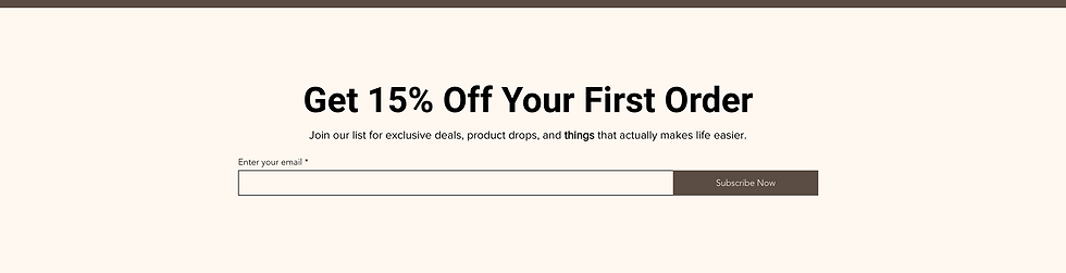
What to Include:
Headline (e.g. “Get 10% Off Your First Order”)
Field for email address
Submit CTA button (e.g. “Join the List”)
Pro Tip:
Offer a lead magnet, value proposition like a discount, free shipping, or downloadable guide.
I highly recommend placing your newsletter sign-up in your website footer so it’s visible across every page. If lead capture is one of your primary goals, consider also including the form higher up on your homepage or using a well-timed pop-up to draw attention.
Make it enticing: Offering a special discount, early access to new products, or exclusive perks is a great way to grow your email list. Use clear, benefit-driven messaging. If it aligns with your brand voice, don’t be afraid to have fun with the language to make your offer stand out.
8. Instagram or Social Media Feed (Optional)
Why Include:
Adds social proof and freshness to the homepage/site.
Social Media Links and Feeds: Build Trust Through Visibility
For businesses or eCommerce brands that are active on social media, adding your social icons with clickable links to your website is a must. A best practice is to include them in your footer so they’re accessible on every page. If social media is a major part of your digital marketing strategy, and you have the space, you can also consider placing them in your site’s header for extra visibility.
When to Add a Social Media Feed
If customers are posting amazing photos of your products or experiences on platforms like Instagram or Pinterest, it might be a great idea to feature a curated social media feed on your site. This adds credibility, builds social proof, and strengthens trust with potential customers.
A Quick Tip: If you use a live social media feed, be prepared to monitor it regularly to ensure only appropriate and on-brand content shows up. Personally, I recommend curating your feed. Collect the best images or posts and upload them manually to a dedicated section. This gives you full control and avoids any tech issues with direct feed plugins or apps.
9. Footer

What to Include:
Navigation links
Contact information
Return policy / Privacy policy
Social media icons
Email sign-up (if not above)
Don't Overlook Your Footer, It's Prime Real Estate
Your website footer might be at the bottom of the page, but it plays a big role in building trust and improving navigation. It’s the perfect place to include essential links like your privacy policy, return information, contact details, social media icons, and newsletter sign-up. Think of it as your website’s catch-all for helpful resources, clean, simple, and easy to find when a visitor needs it most.

Bonus: Mobile-Friendly eCommerce Design Tips
In today’s mobile-first world, your website needs to look great and work seamlessly on smartphones and tablets. Most people will discover and interact with your website from a mobile device, especially if you're promoting your products through social media or running ads.
Once your site is live, take a look at your analytics to see what percentage of your traffic is coming from mobile vs. desktop. This insight can help guide future design decisions and ensure you're optimizing for where your audience actually is.
As you implement the homepage design elements we covered, keep both desktop and mobile users in mind. Here are a few quick tips to ensure your site stays mobile-friendly:
Use large, tap-friendly CTAs (Call-to-Action buttons)
Make product cards scrollable and easy to browse
Keep pop-ups minimal and easy to dismiss
Use legible font sizes and clear spacing
Optimize images and layouts specifically for smaller screens
A responsive design isn’t just a nice-to-have, it’s essential for improving your user experience, boosting conversion rates, lowering your bounce rate, and keeping your site looking professional across all devices.
Build It
Using the steps above start to map out your own website's home page. Follow these steps to guide you:
Determine which sections (blocks) you want to include.
Identify your ideal order of how these blocks stack up on your page.
Do an inventory of the content you want to include on each block - do you currently have what you need, or do you need to generate more content items.
Build it out. Start to create each section block in your website builder.
Don't worry if you find yourself trying different block layouts, reordering items on your page or going back to the drawing board a few times. This is all a part of the process. Trial and error will lead to something great for your brand.
What's up next?
Continue through the Website eCommerce series with one of these guidelines:


Comments